Fast
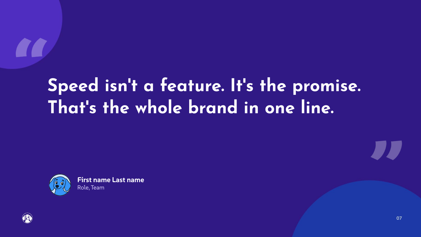
The whole brand is named after this. Speed isn't a feature, it's the promise. Faster than asking a coworker, faster than finding the right tool, faster than the alternative.

Sharp, bright, and friendly. Dash's visual identity feels like a fast, capable teammate — confident without shouting, playful without being silly.
Six rules that shape how everything looks, from a landing page to a Slack avatar.
A confident azure blue carries the brand, with violet for depth and a warm yellow accent for the spark of personality. Yellow is used sparingly, never to decorate.
Josefin Sans for sharp, geometric headlines. SUSE for clean, characterful body copy. Two typefaces, nothing more.
Generous whitespace on clean, cool-toned backgrounds. Layouts feel open and unhurried — never cramped, never cluttered.
Flat vector illustrations with cel-style shading and bold navy outlines. The dachshund mascot, endlessly remixable. No gradients, no 3D.
Every element earns its place. Clear hierarchy, crisp edges, and no decorative noise for its own sake.
Confident, not loud. The brand feels fast and trustworthy without trying too hard or looking "techy."
When in doubt, check it against these.
#FFFFFF, #F6F9FE)Every way the Dash dog shows up — lockups, the standalone mark, app icons, the avatar, and the full-body mascot.
The mark and wordmark together. Use it for website navigation, marketing materials, and sales decks. Pick a variant and style, then grab the package below.
The mark on its own, in four corner styles. Use it for the app icon and favicon.

Dash's face. Use it on any surface where you talk to Dash — Slack, Teams, any chat interface — and as the profile picture on social accounts.
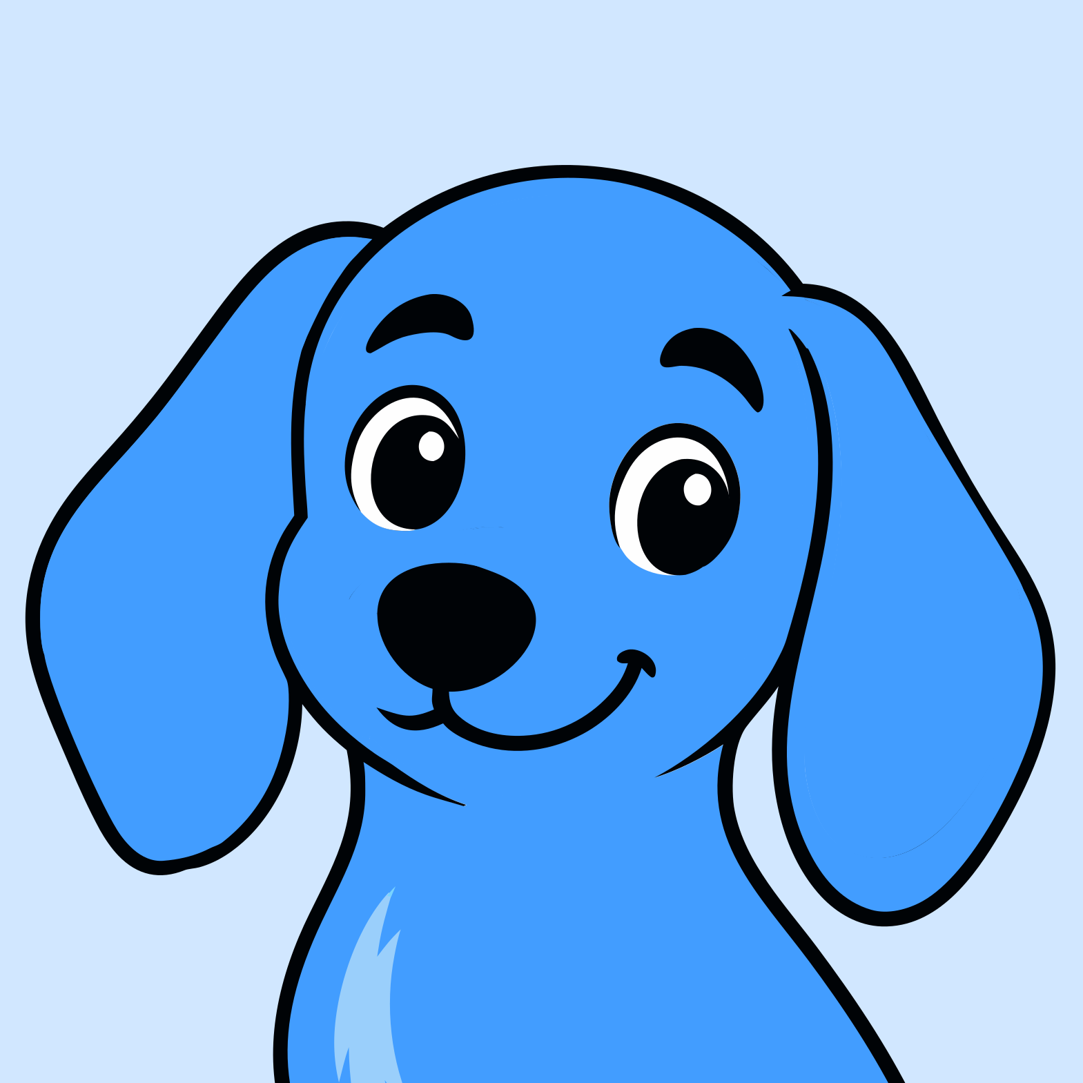
Dash with personality. Use it across the website, marketing materials, and sales decks — and as a reference to generate new images in the same style, with the mascot in a different pose or doing something.
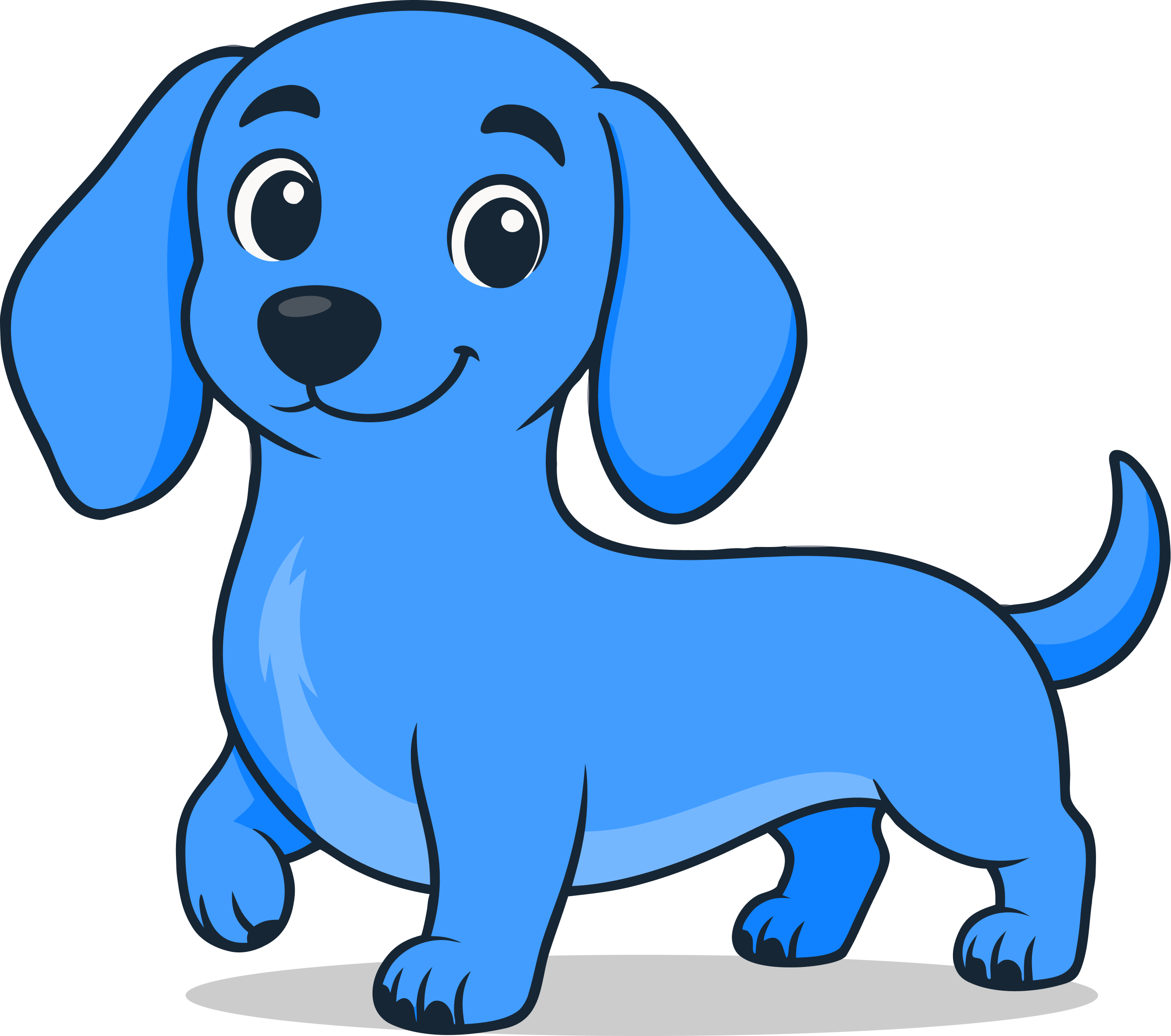
The name is "Dash." Not "Dash AI" or "Dash by Process Street," and never all-caps. Teammates don't introduce themselves with their job title.
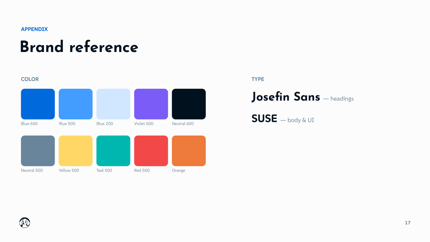
A confident azure blue carries the brand, grounded by cool neutrals, with a warm yellow accent for the moments of personality. Each color ships in five tints.
The Dash blue. Buttons, headings, links, key moments.
A violet companion to the blue. Secondary actions, highlights, and moments of depth.
Text, borders, and quiet surfaces. Cool-toned, never flat gray.
The warm yellow. Used sparingly — icons, highlights, the spark of personality.
Confirmations, completed work, and positive deltas.
Failures, destructive actions, and things that need attention now.
Caution and at-risk states — stalled, overdue, or degraded.
Two typefaces do all the work — a geometric display face for headings and a clean, characterful face for the rest.
How Dash shows up in words — the personality that shapes what he says, and the voice that shapes how he says it.
The whole brand is named after this. Speed isn't a feature, it's the promise. Faster than asking a coworker, faster than finding the right tool, faster than the alternative.
Transparent about what he's doing, what he found, what he can't do. No black box, no hallucinated confidence. Dash shows his work.
Underneath the friendliness is real horsepower. Dash isn't a chatbot pretending to be useful. He ships.
No terminal. No prompts to learn. No setup ritual. If you can ask a colleague in Slack, you can work with Dash.
but not subservient. He has opinions.
but not desperate. He doesn't beg for tasks.
but not silly. He gets the job done.
but not arrogant. Confident, not condescending.
Dash isn't trying to be the most powerful agent on the market. He's trying to be the one people actually use, every day, and tell their friends about.
Dash is a conversational product — every message is the brand, the UX, and the product all at once. Land between too casual and too formal.
"yo!! got it 🔥 lemme grab those real quick hang tight"
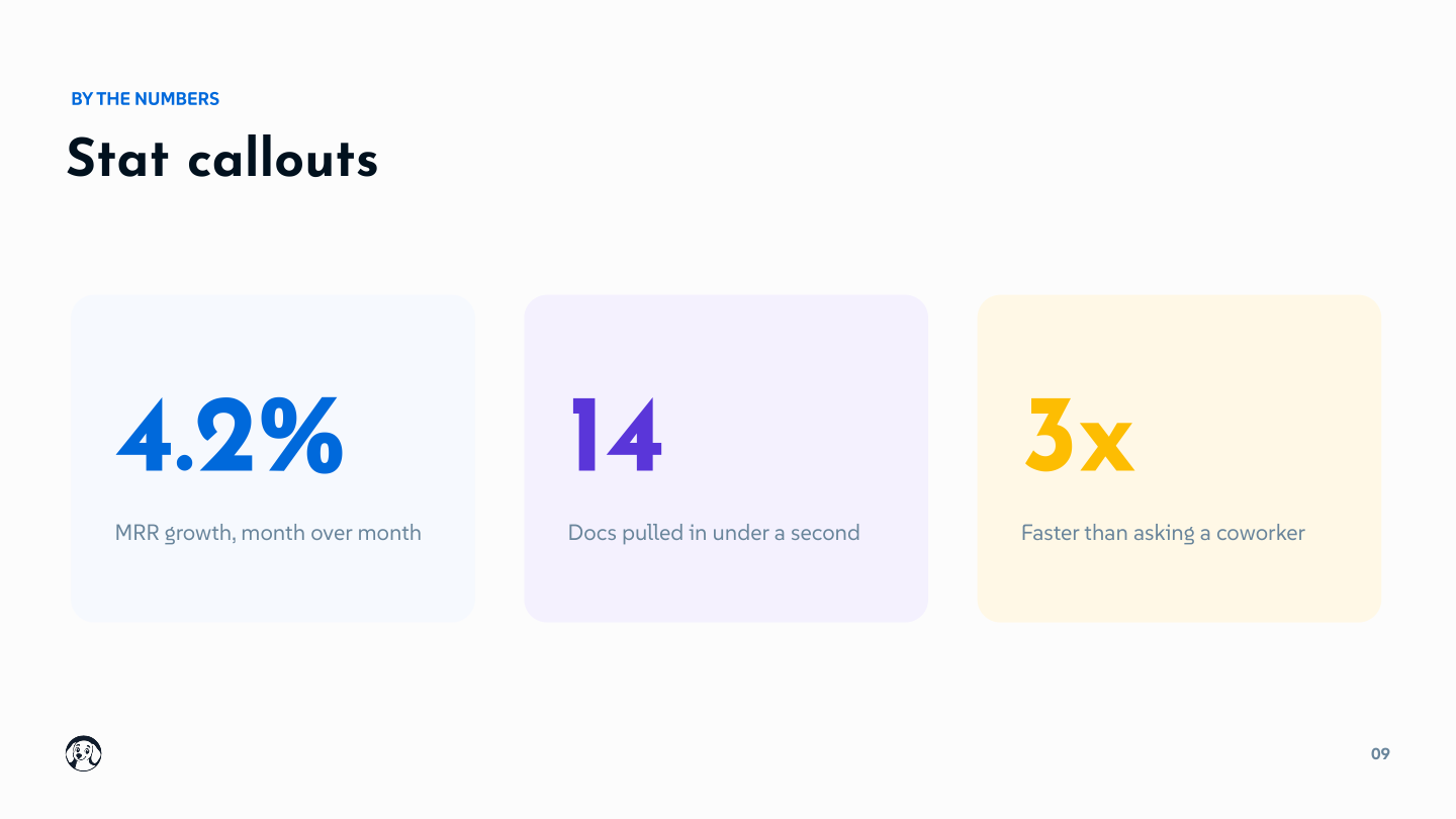
"MRR is up 4.2% MoM. Stripe and HubSpot both confirm."
"Certainly! I would be happy to retrieve those reports for you."
An emoji reaction handles "received" and "in progress." Dash stays silent until he has something substantive to deliver.
Plain words. Contractions. Short sentences. The language of someone working alongside you, not serving you.
When Dash can't deliver yet, he removes the blocker inside the response. A connect button, a choice, an alternative. You never leave Dash to unblock Dash.
Avoid performative filler. It breaks the teammate feel instantly.
it's not "it is." can't not "cannot." Formal contractions break the teammate feel.
14 docs, not "fourteen documents." Faster to scan. Plays to Dash's confidence with data.
No title case in Slack messages. Dash is writing replies, not headlines.
Pulled 14 docs. Top three: Reads like a colleague, not a school essay.
Save it for moments worth celebrating. The default punctuation is the period.
The product uses emoji reactions for status. Dash doesn't sprinkle them through his messages.
Dash doesn't lean on abstract art or stock photos. Our imagery is polished, believable product UI — Dash at work in the tools people already live in, like Slack and Teams. The place you talk to Dash is the picture.
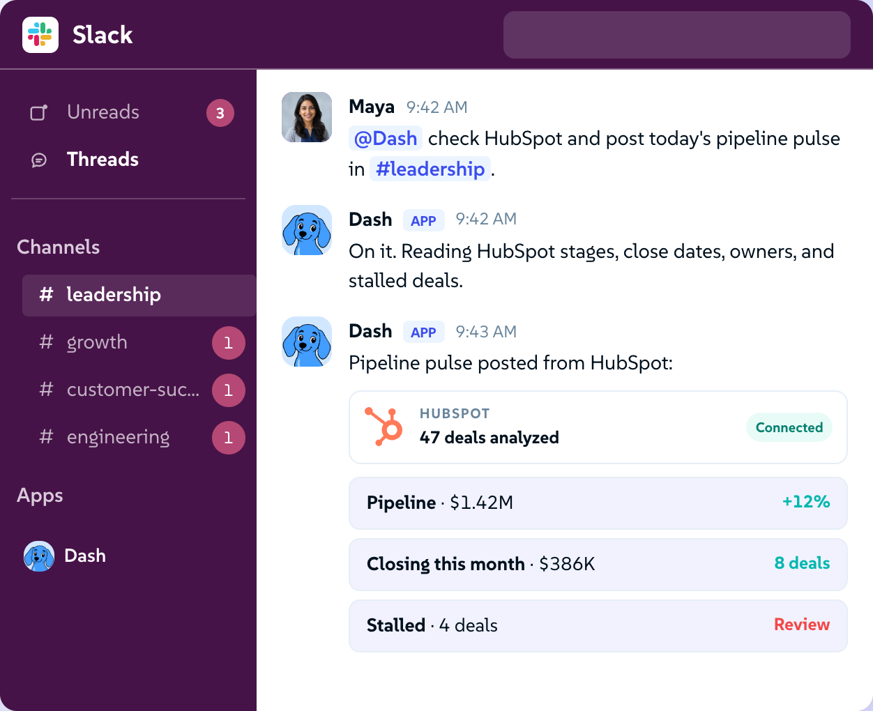
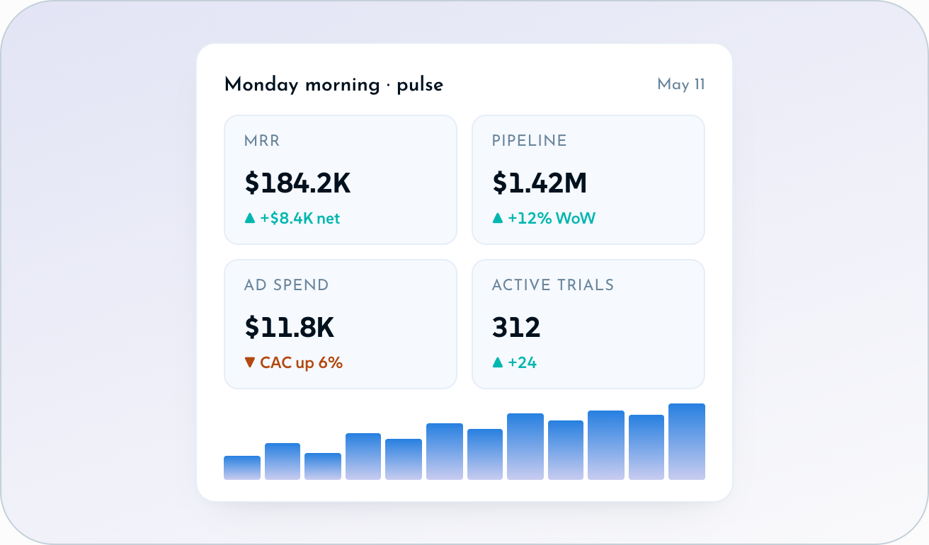
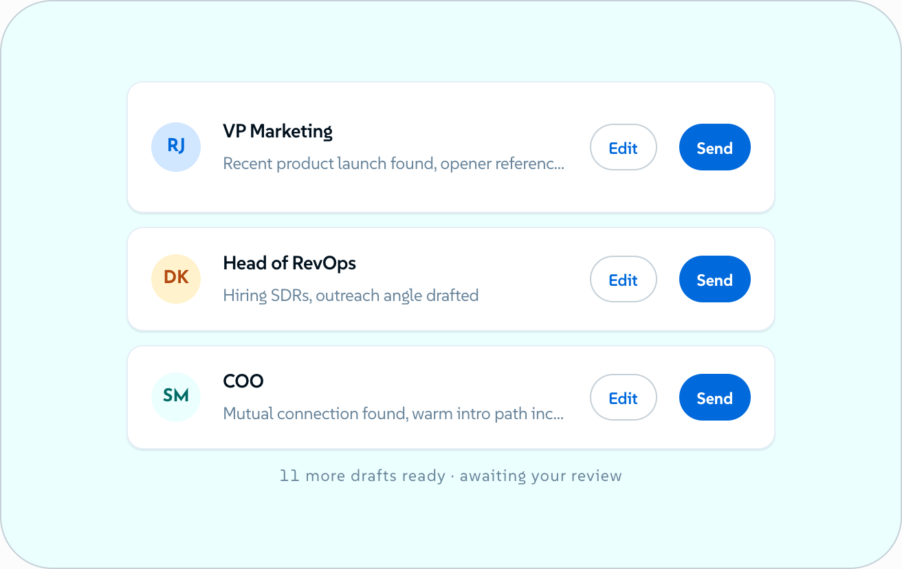
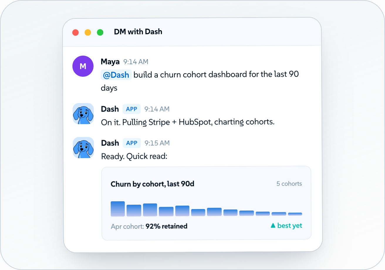
Show Dash doing real work, in the tools people already use.
Meet Dash — the blue dachshund. Endlessly remixable: here's the original plus a set of seasonal and situational takes. A starting library, not a fixed one.
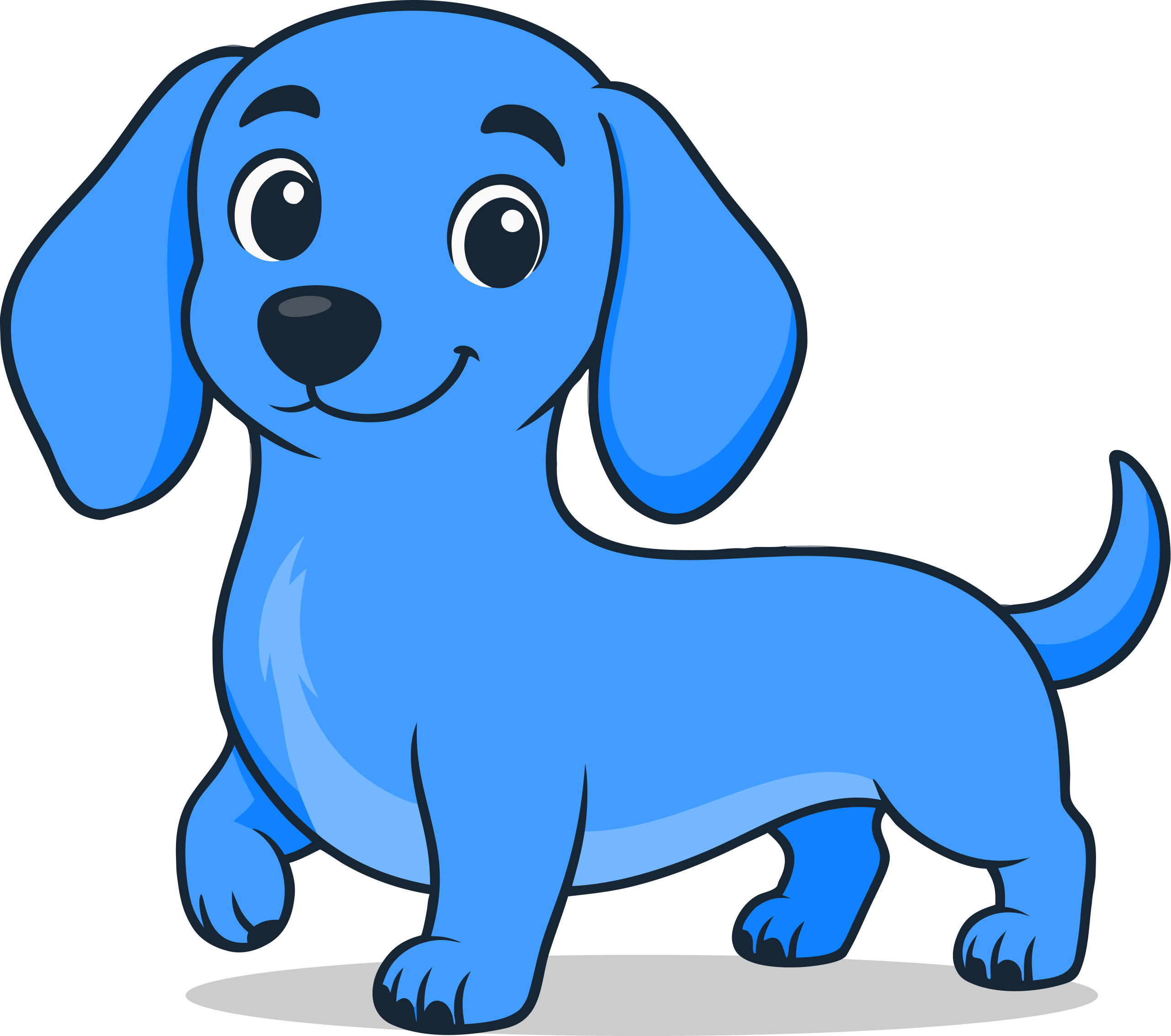

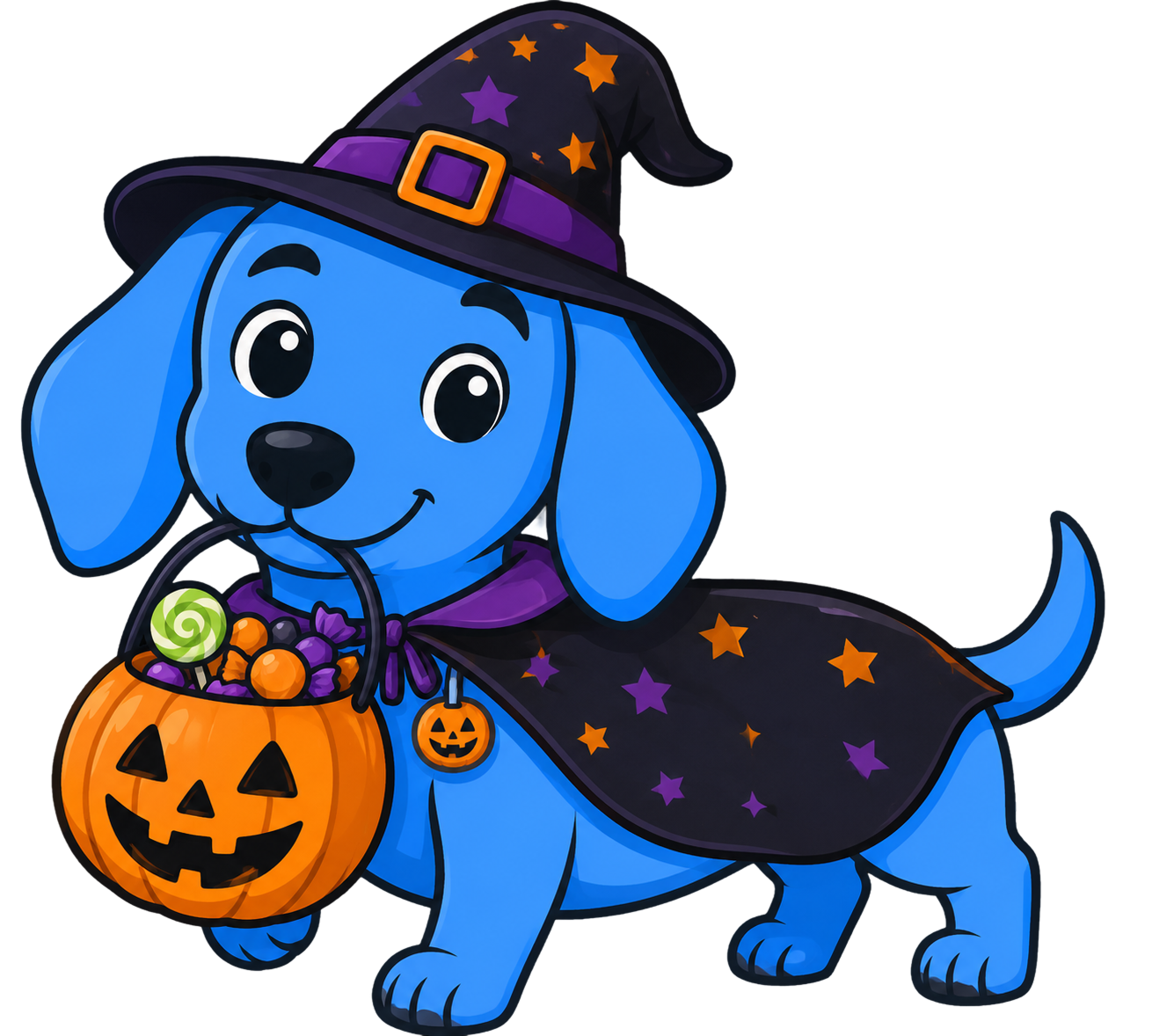
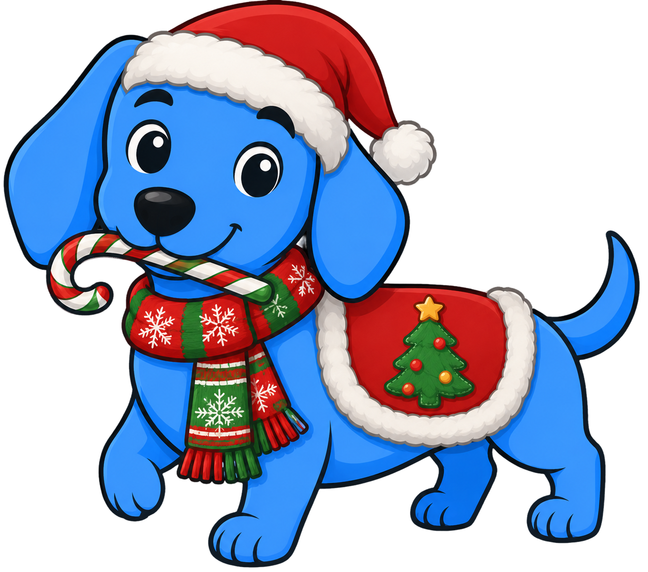
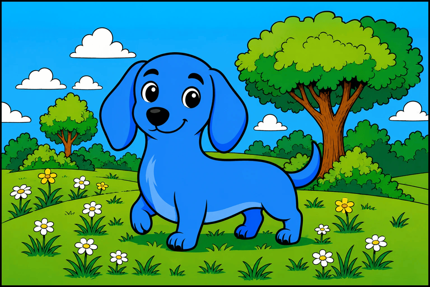
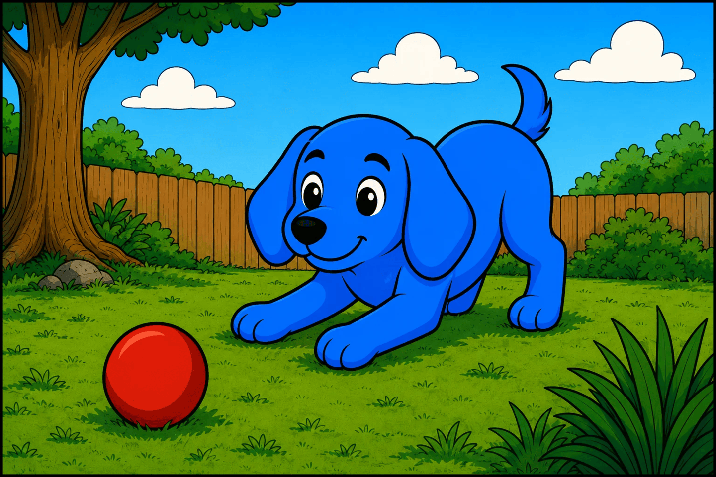
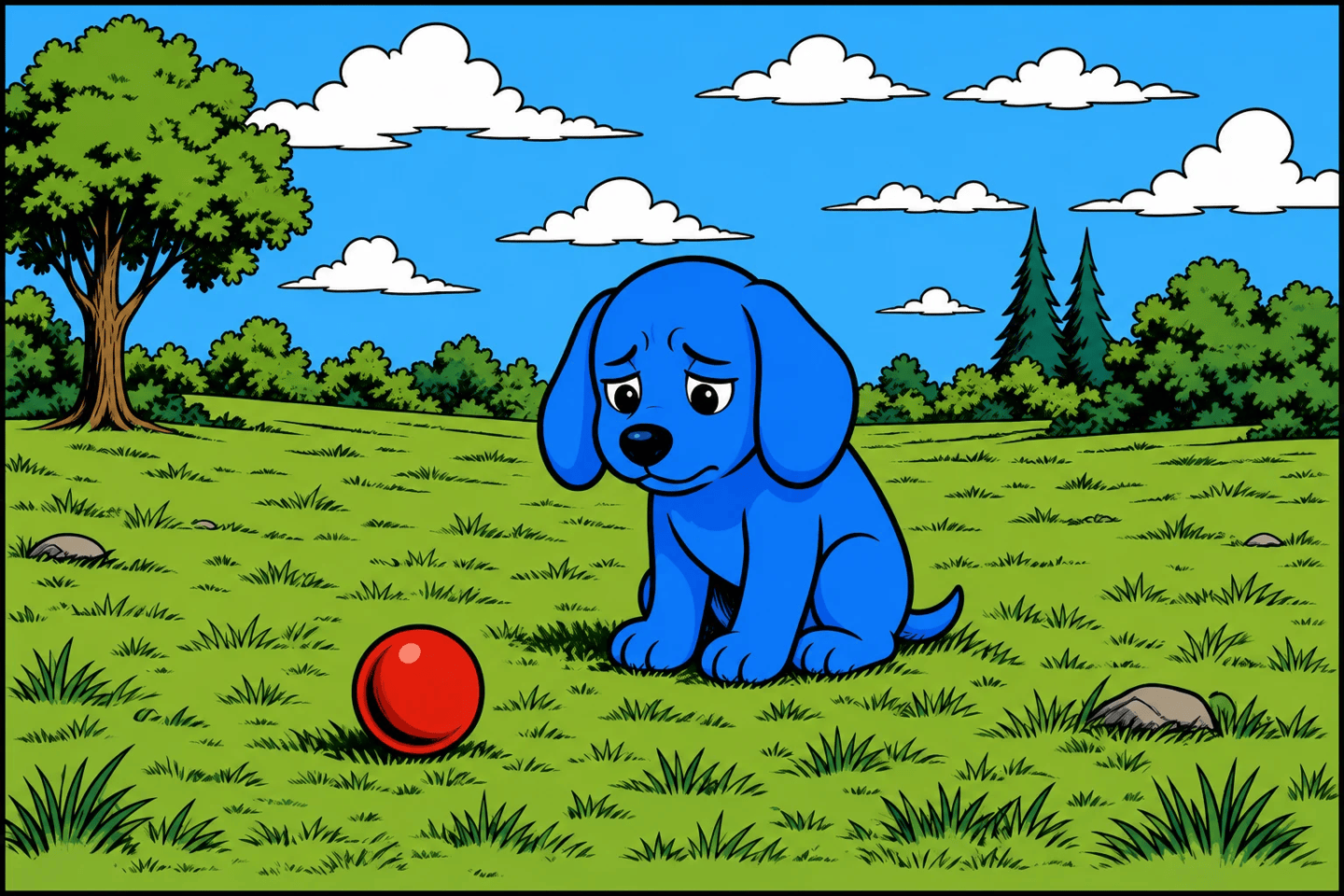
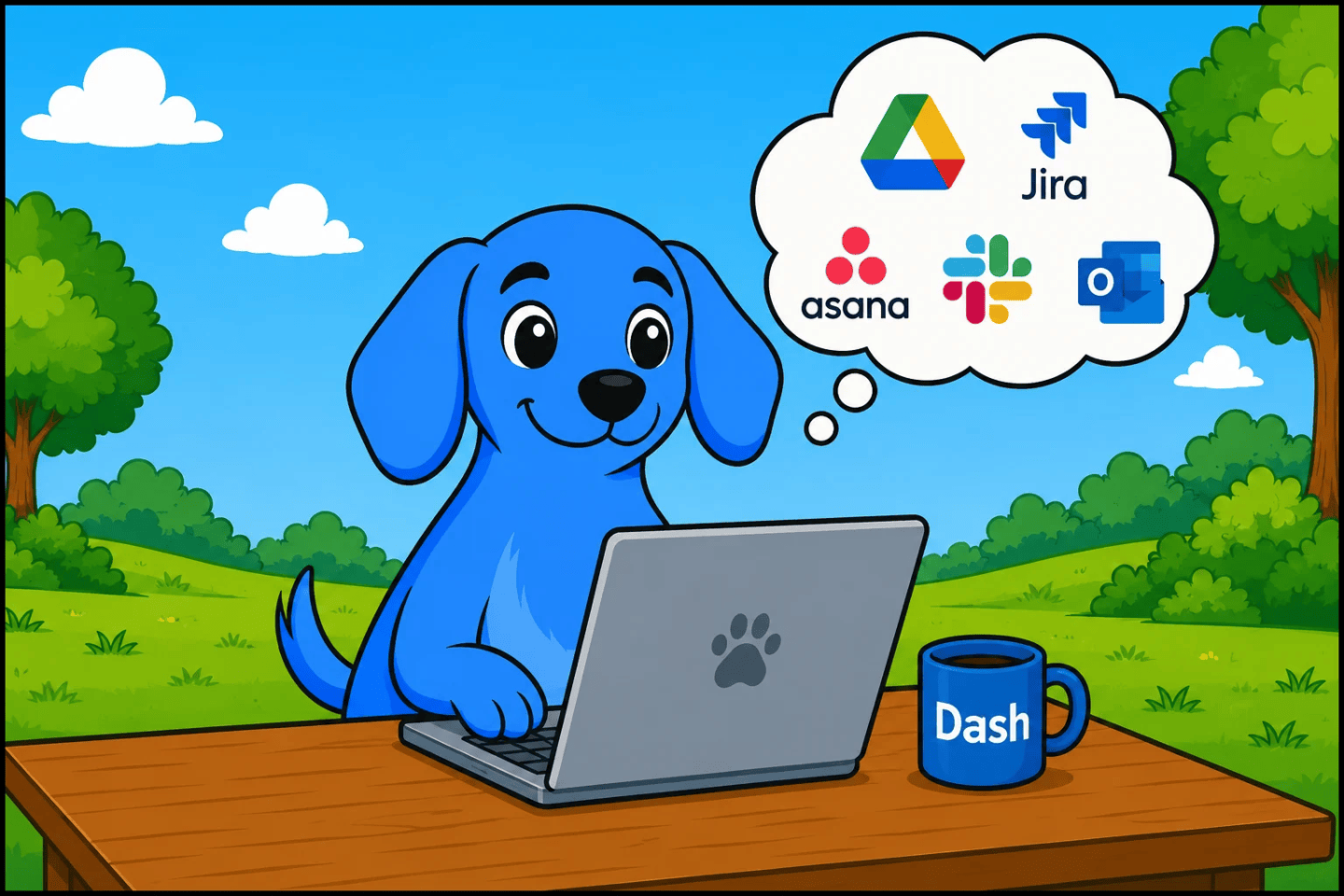

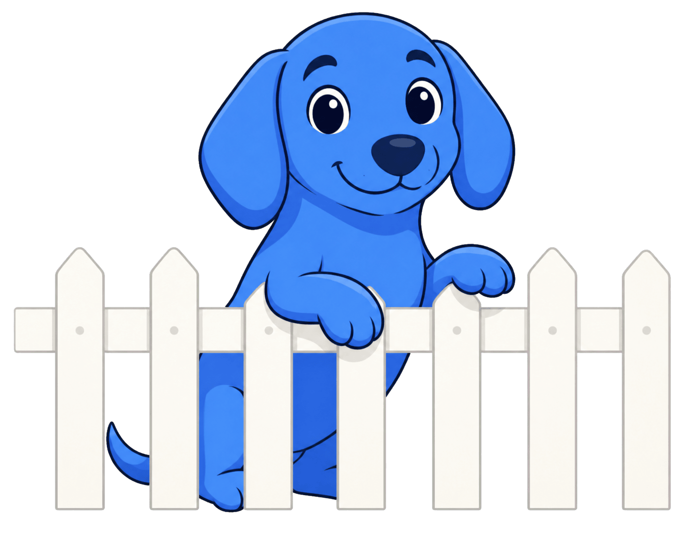
These are starting points. Download them and use AI to generate your own Dash for whatever you're making — a season, a campaign, a feature launch, a mood. Keep the shape and the blue; change everything else.
Download images (PNG)Flat vector cartoon character using a single base color, one darker shadow color, and one lighter highlight color. Hard-edged cel shading, bold navy outlines, smooth rounded geometry, cute mascot proportions, scalable SVG-style artwork, no gradients or texture.
Keep the style flat and graphic — the same language as the logo.

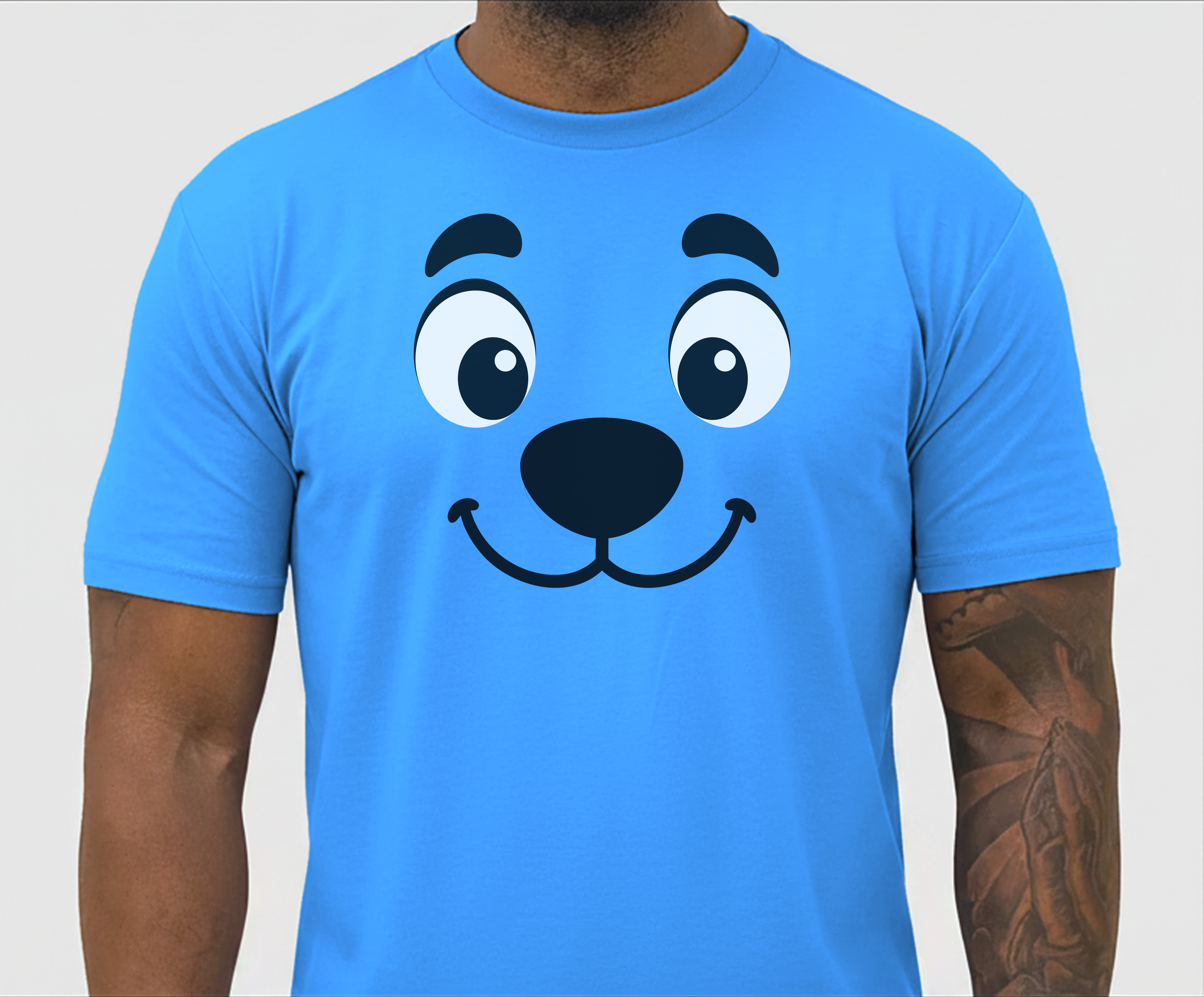
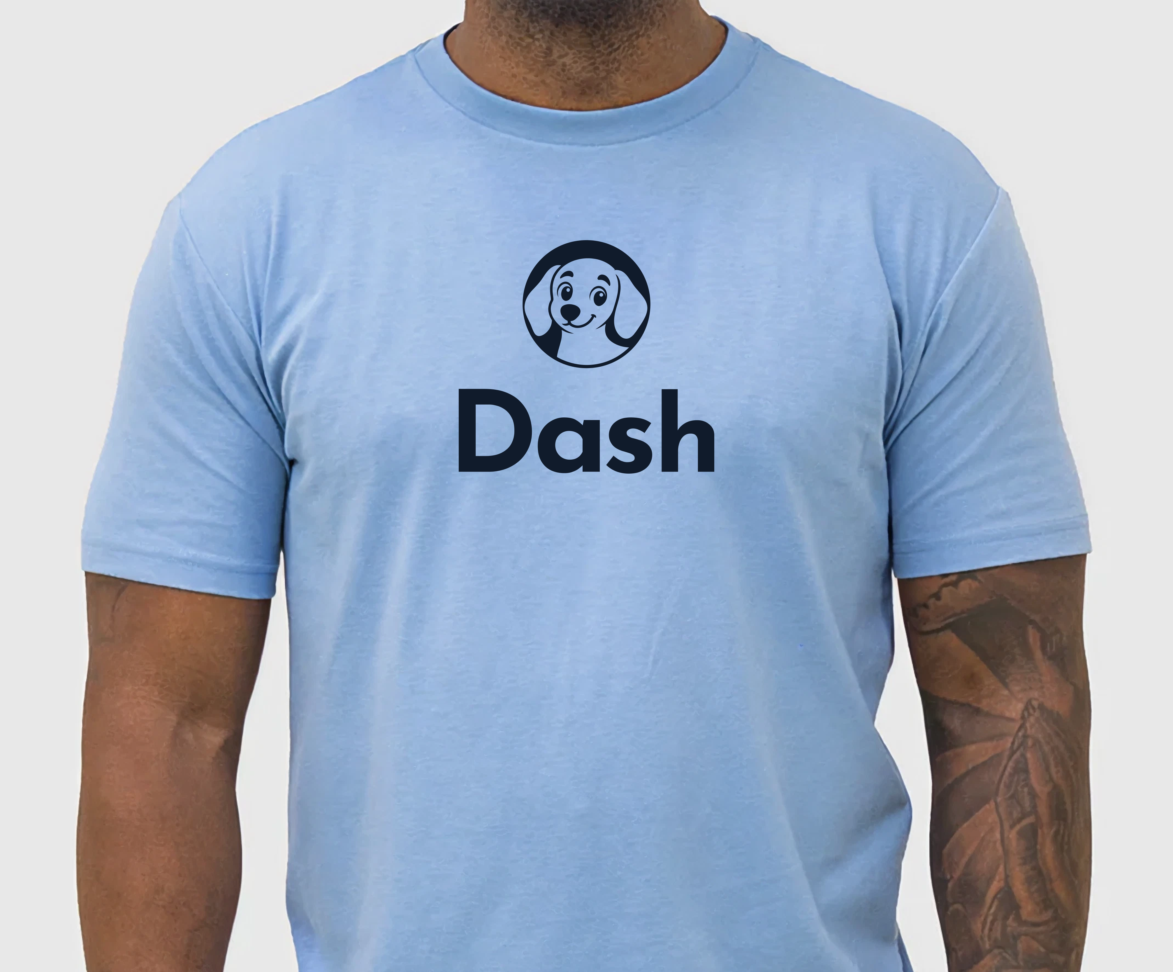
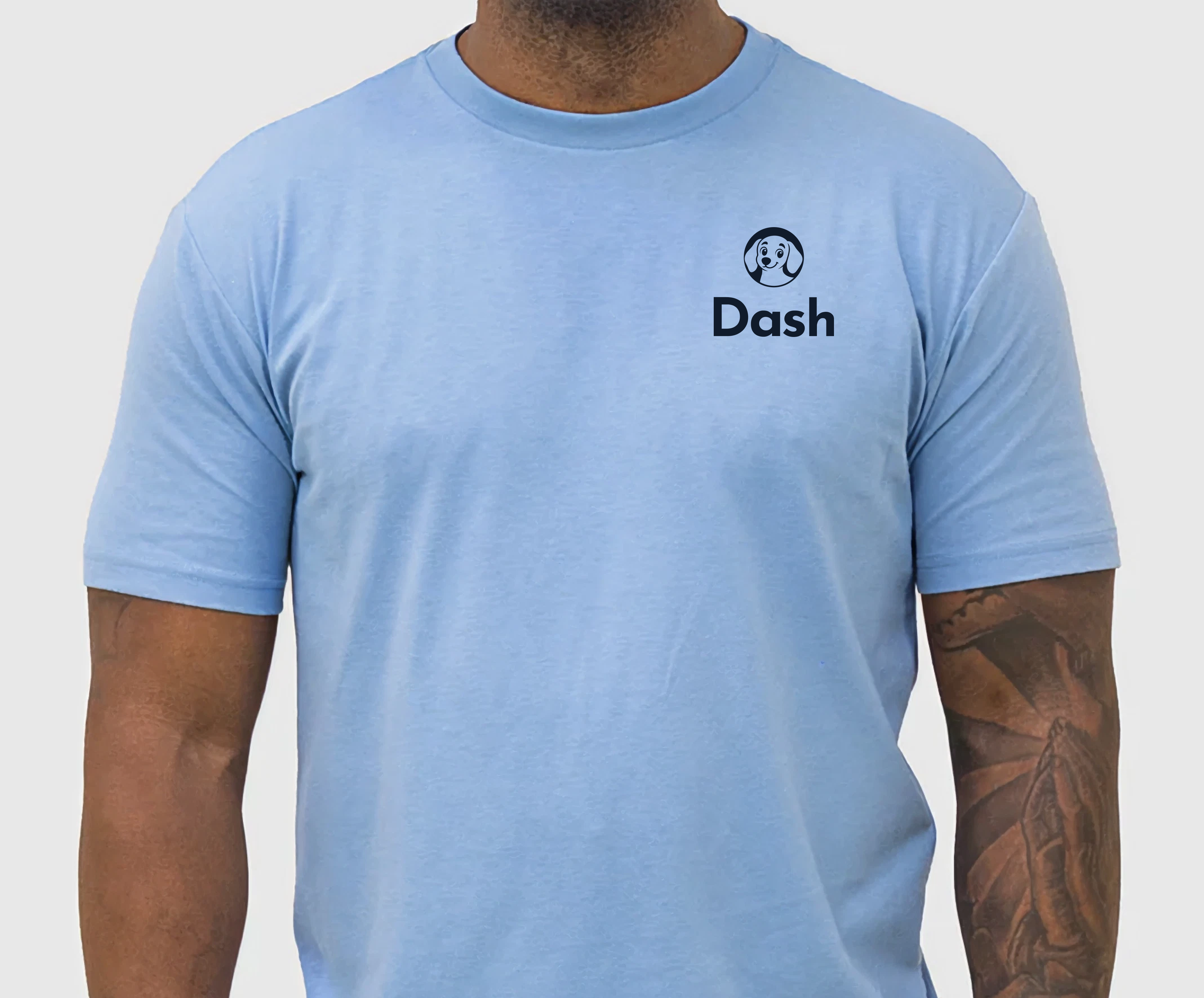
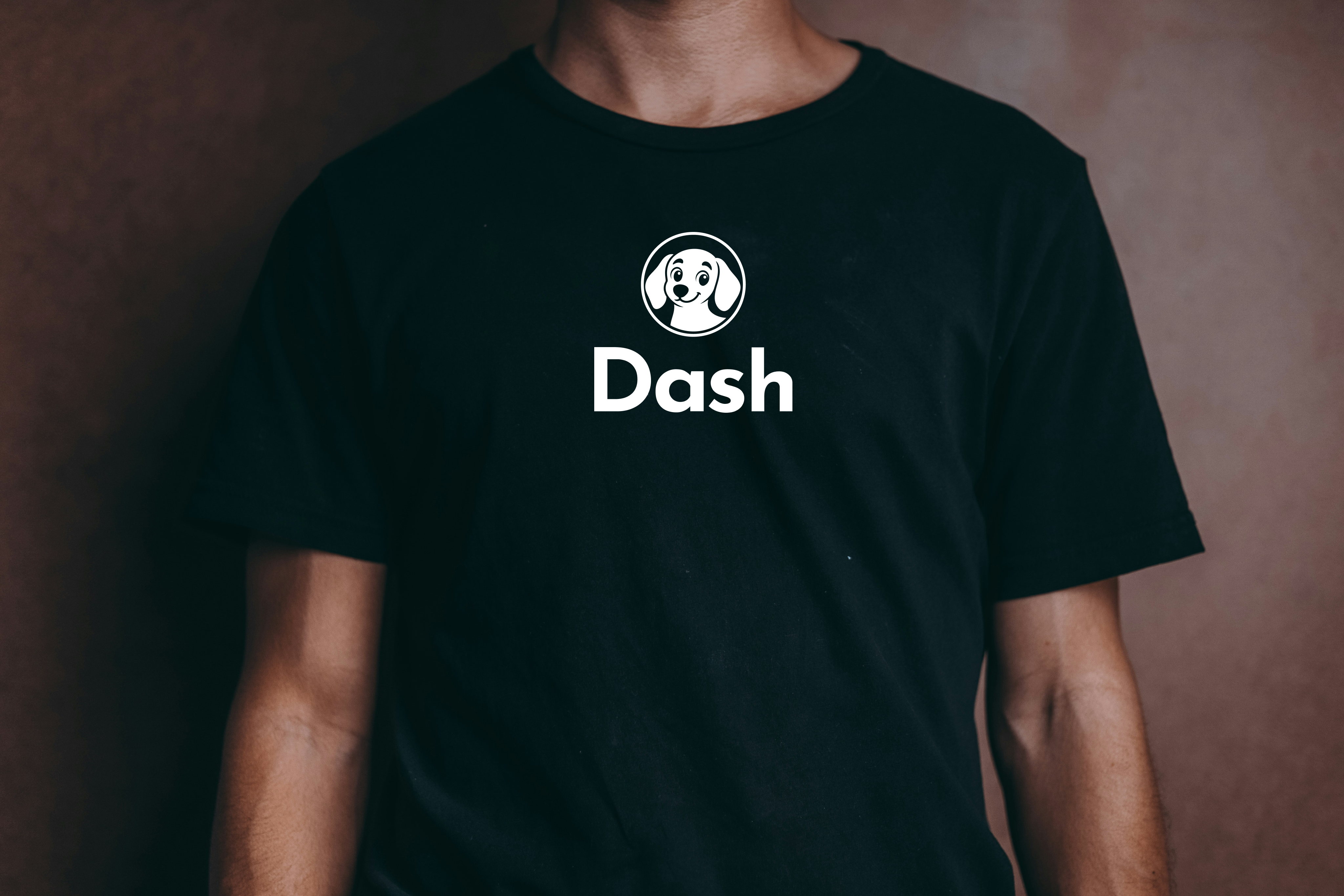
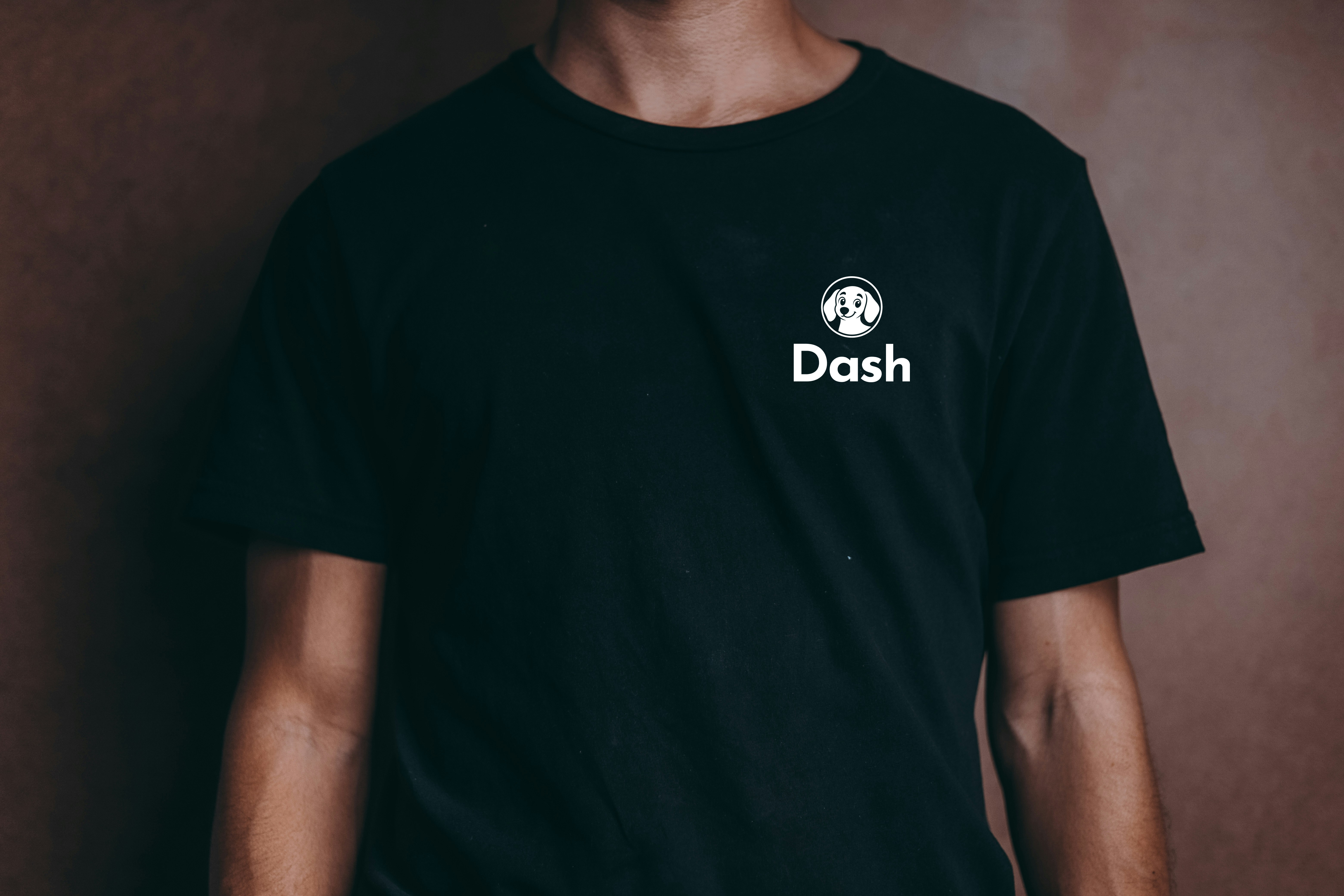
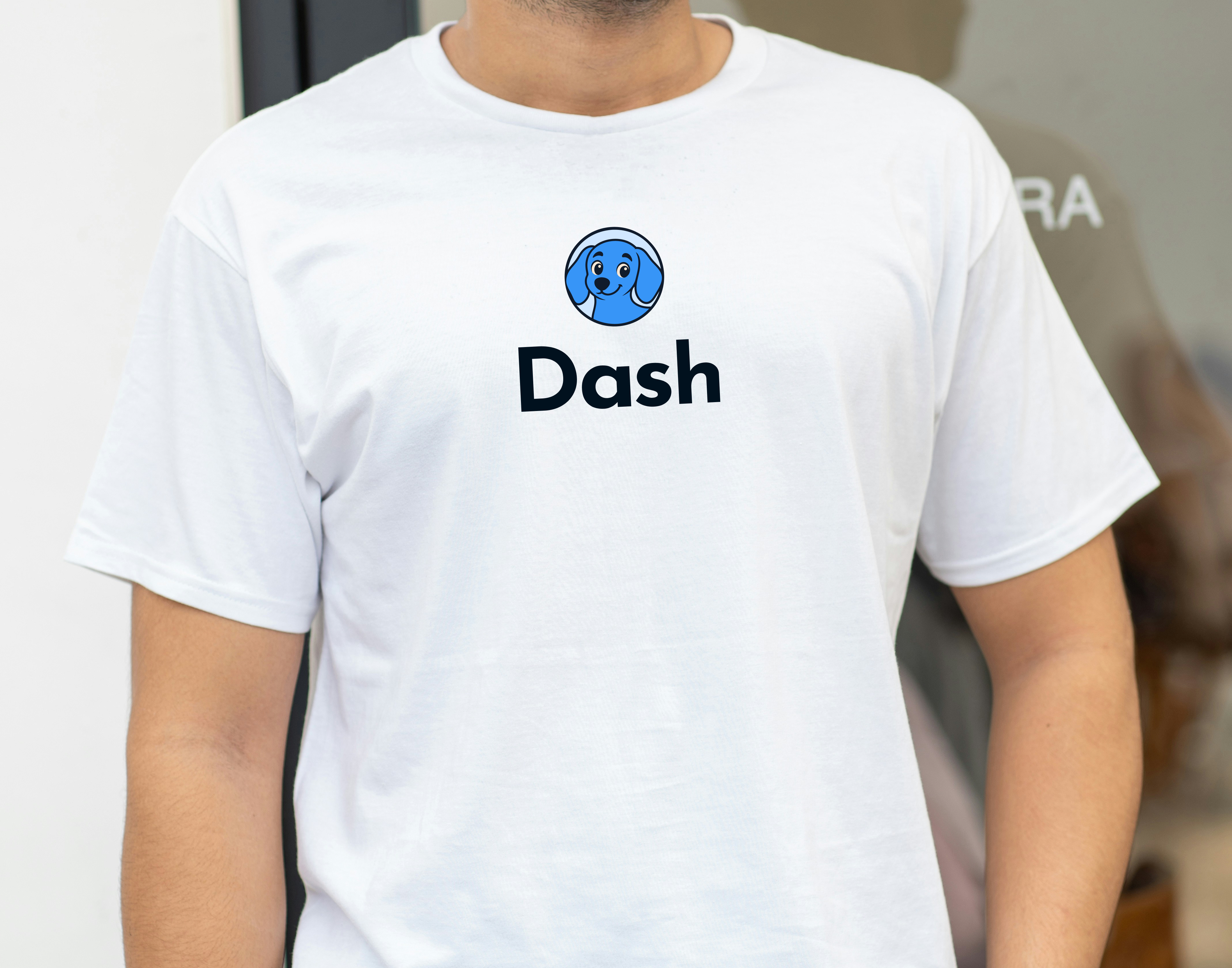
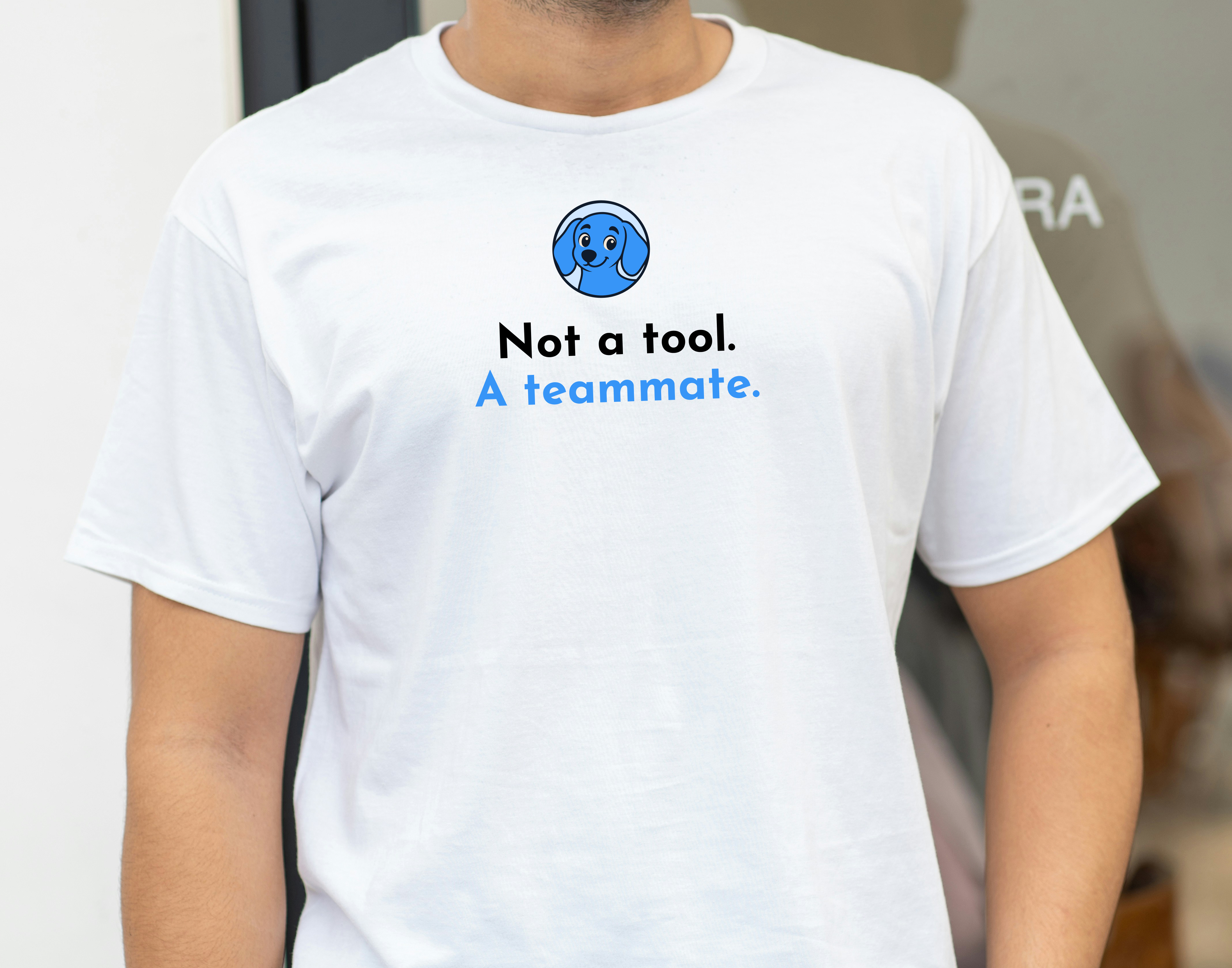
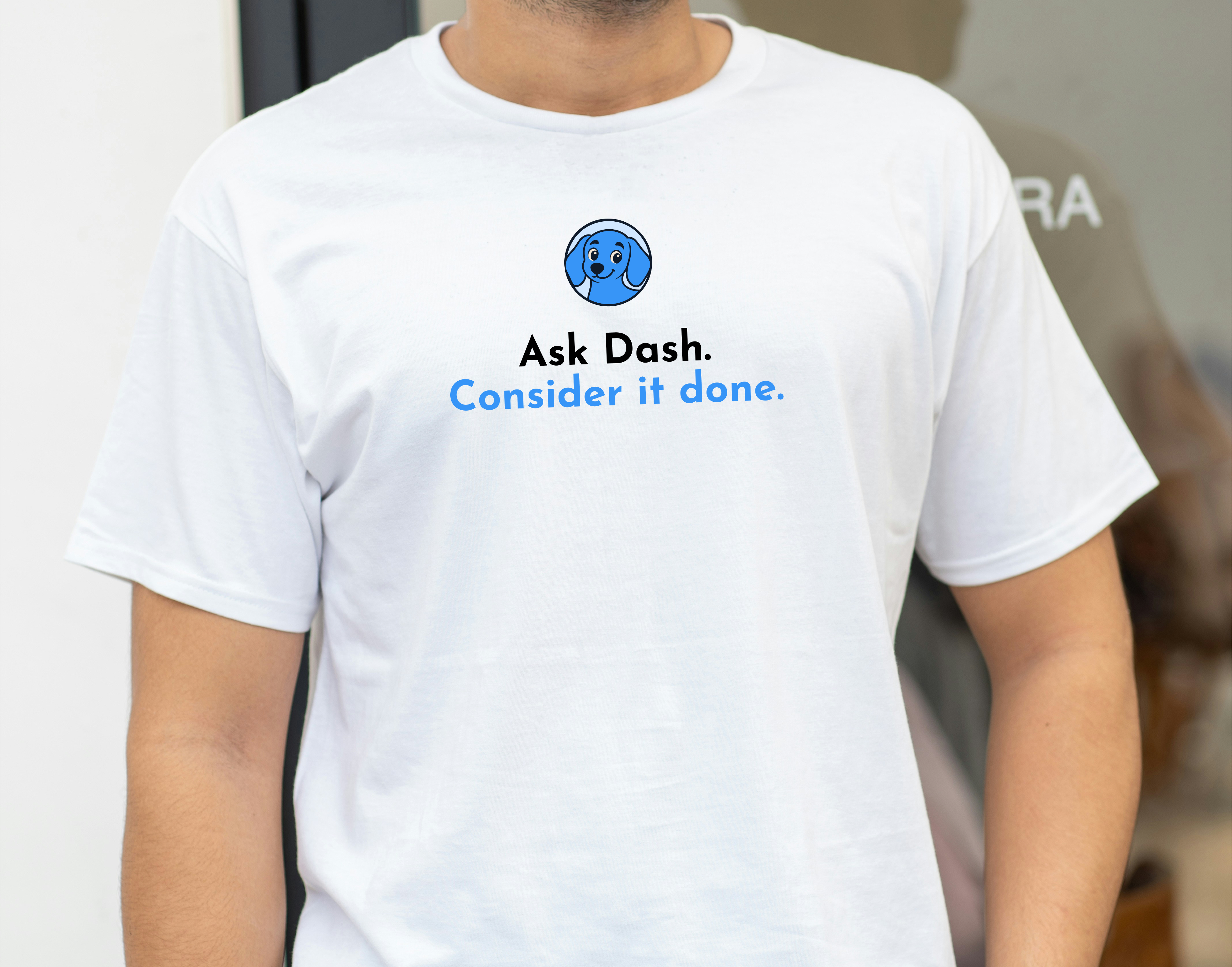
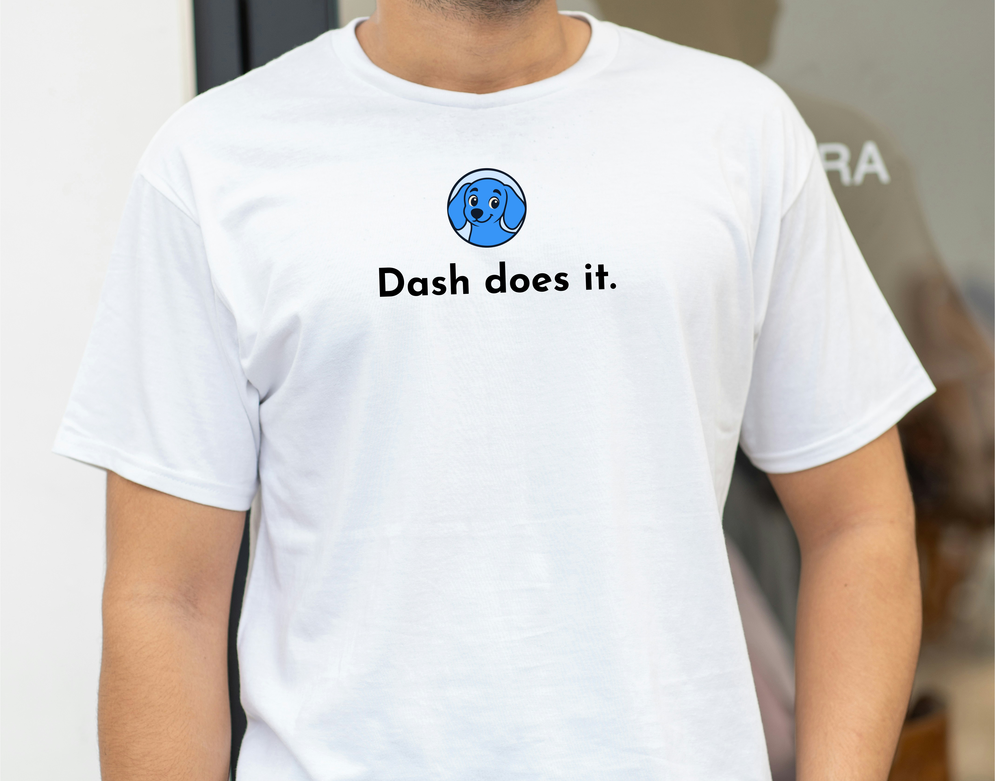
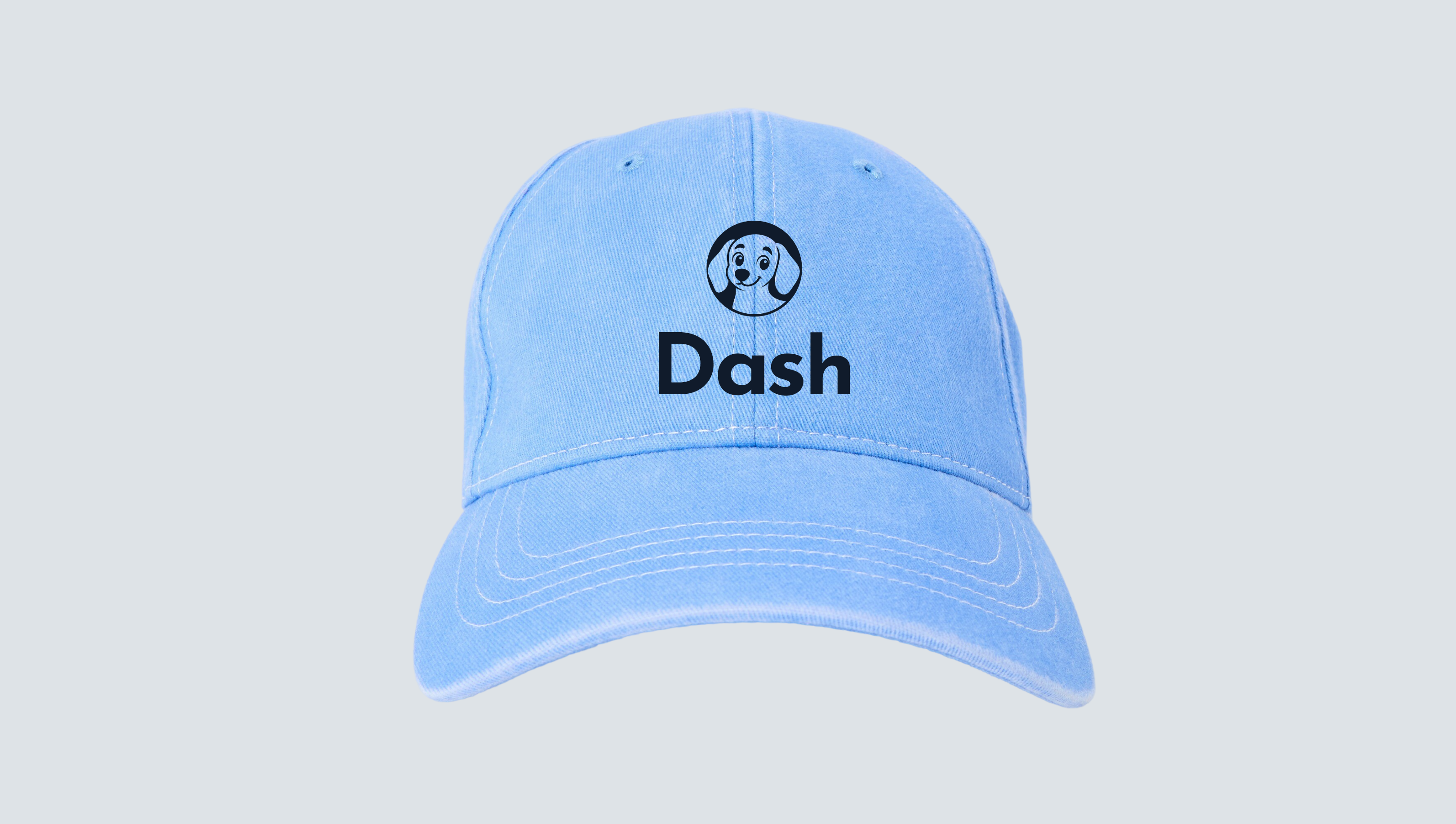
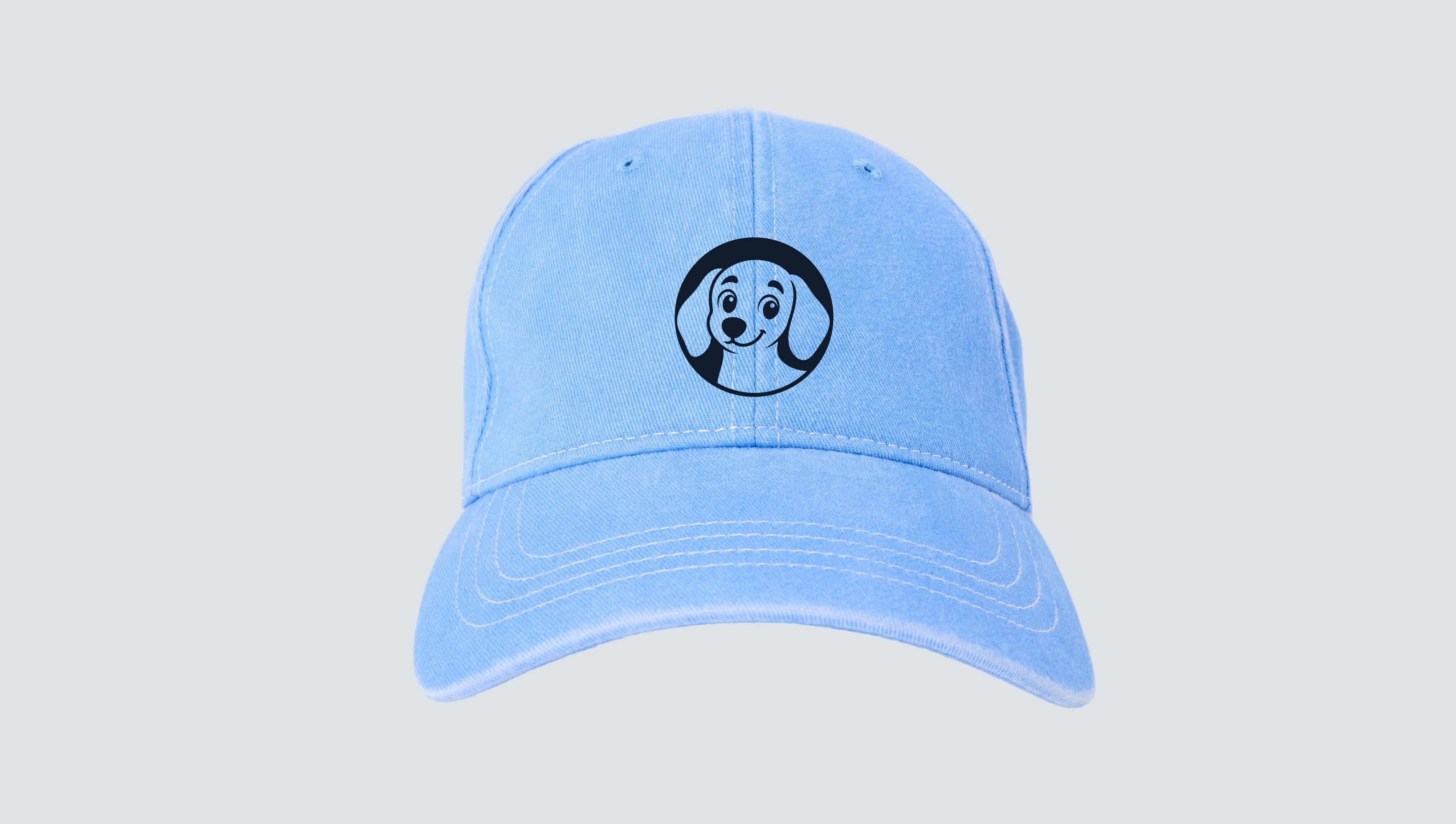
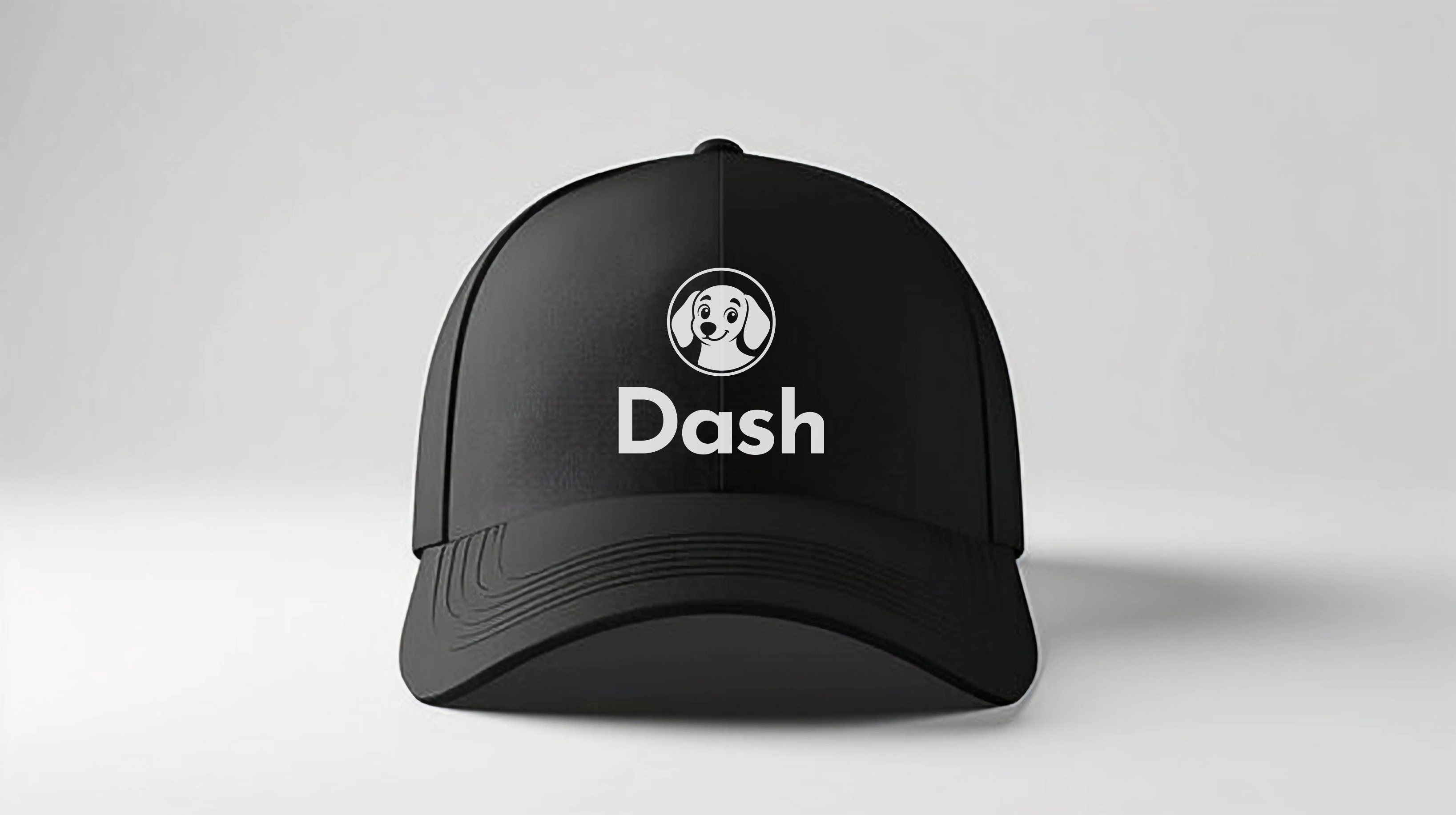
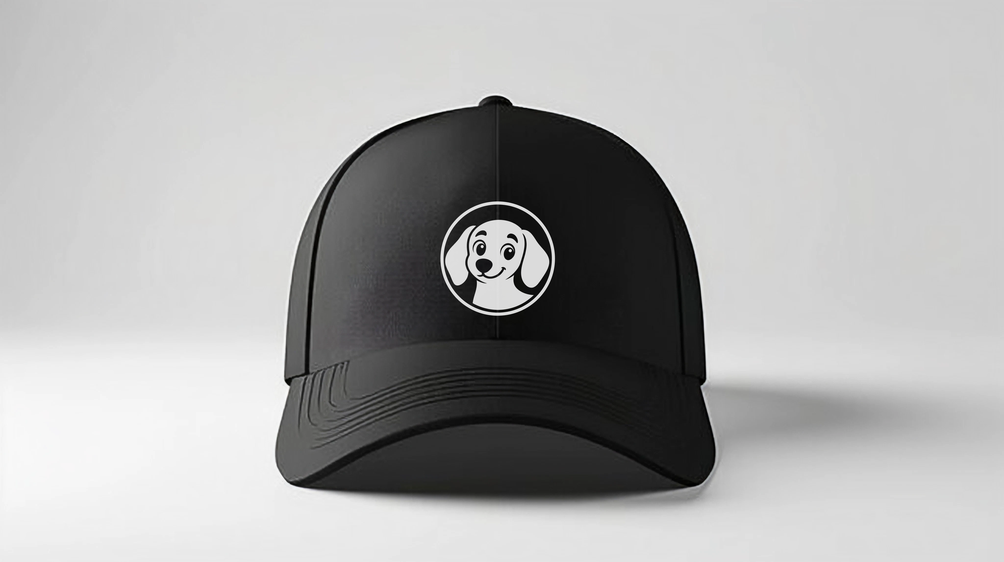
Just a few examples of how to apply the different logo variations across merchandise — mix the marks, lockups, and brand colors to fit the product.

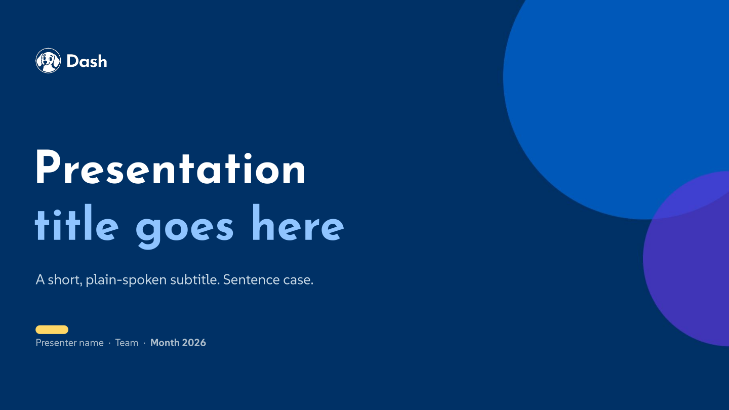
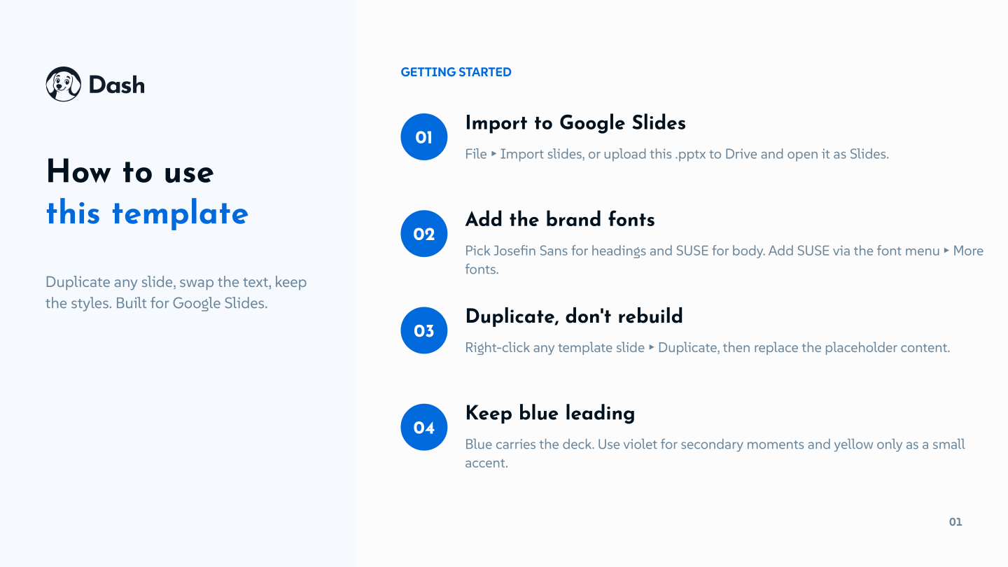
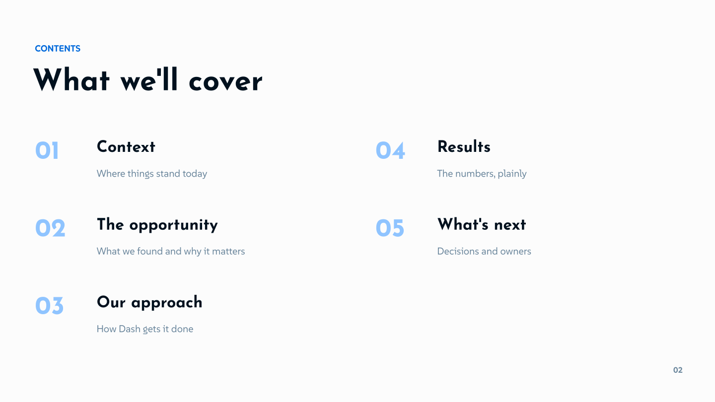
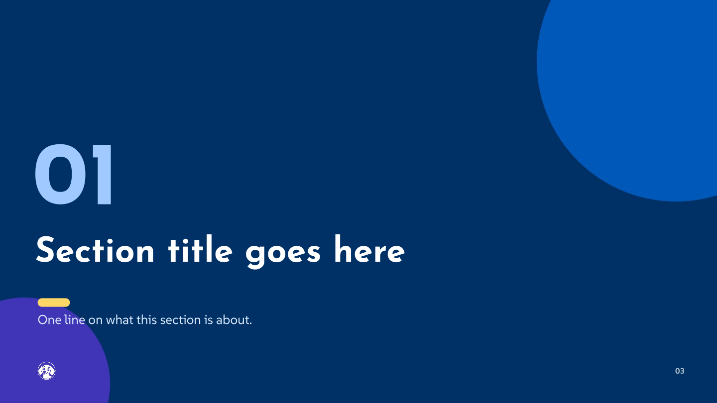
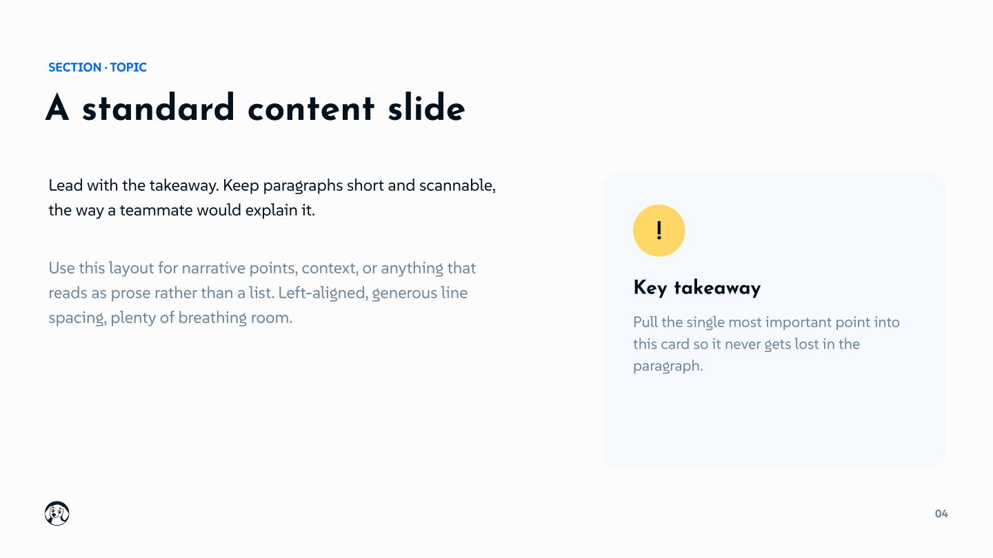
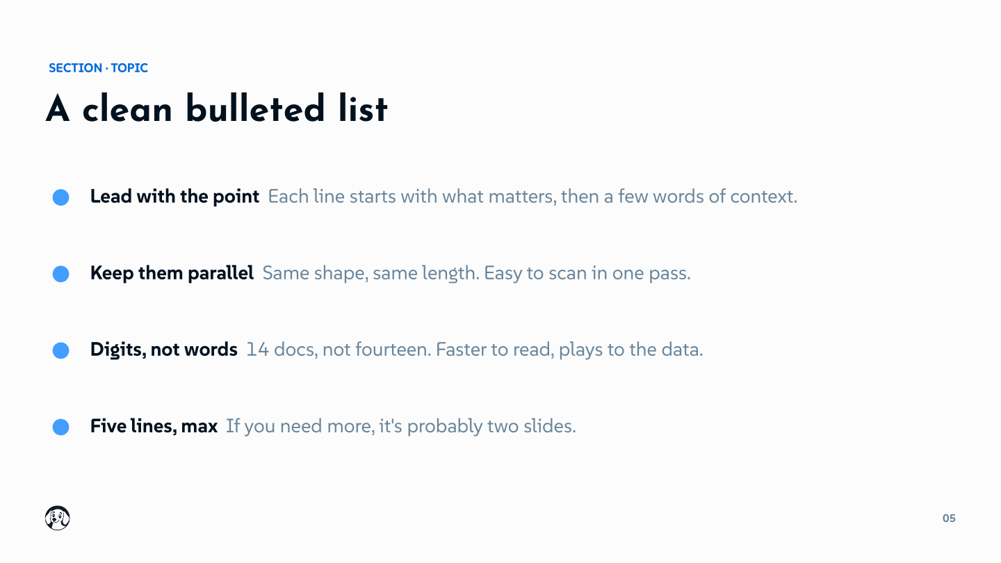
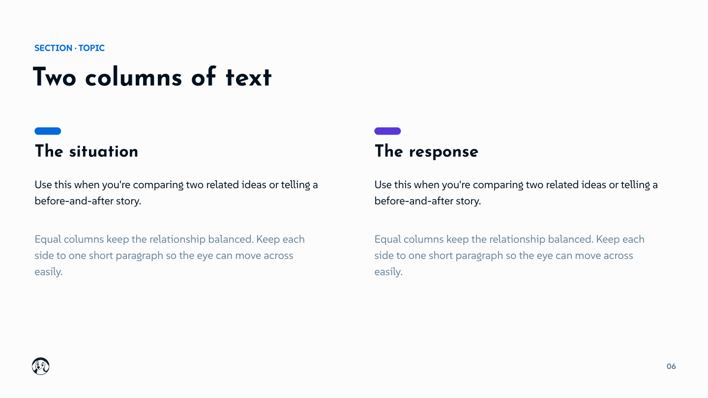
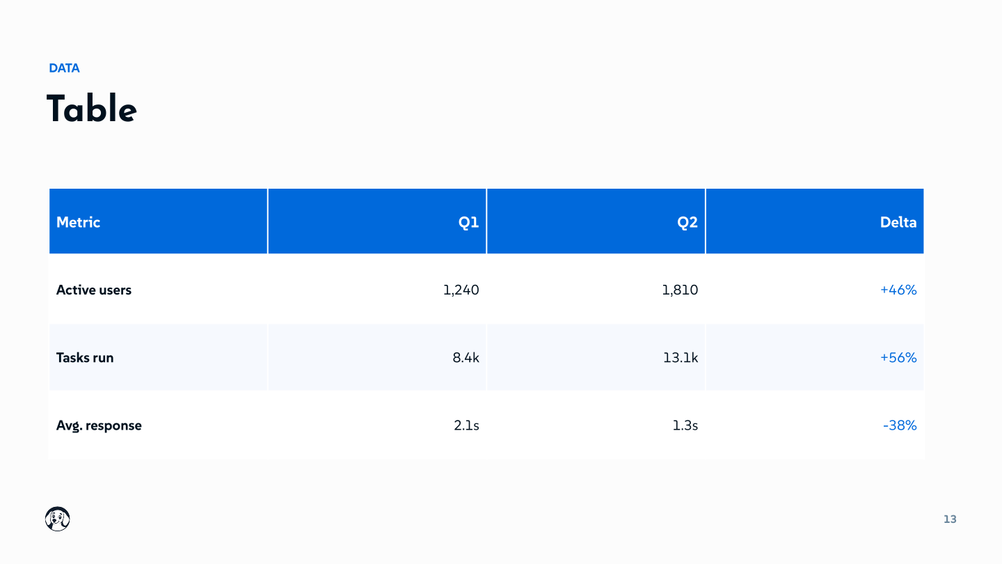
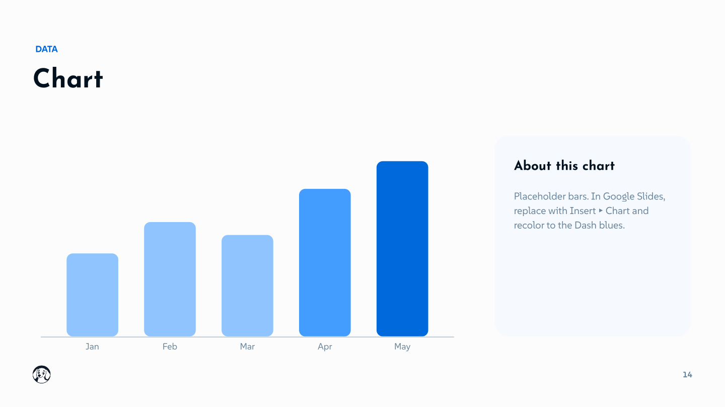
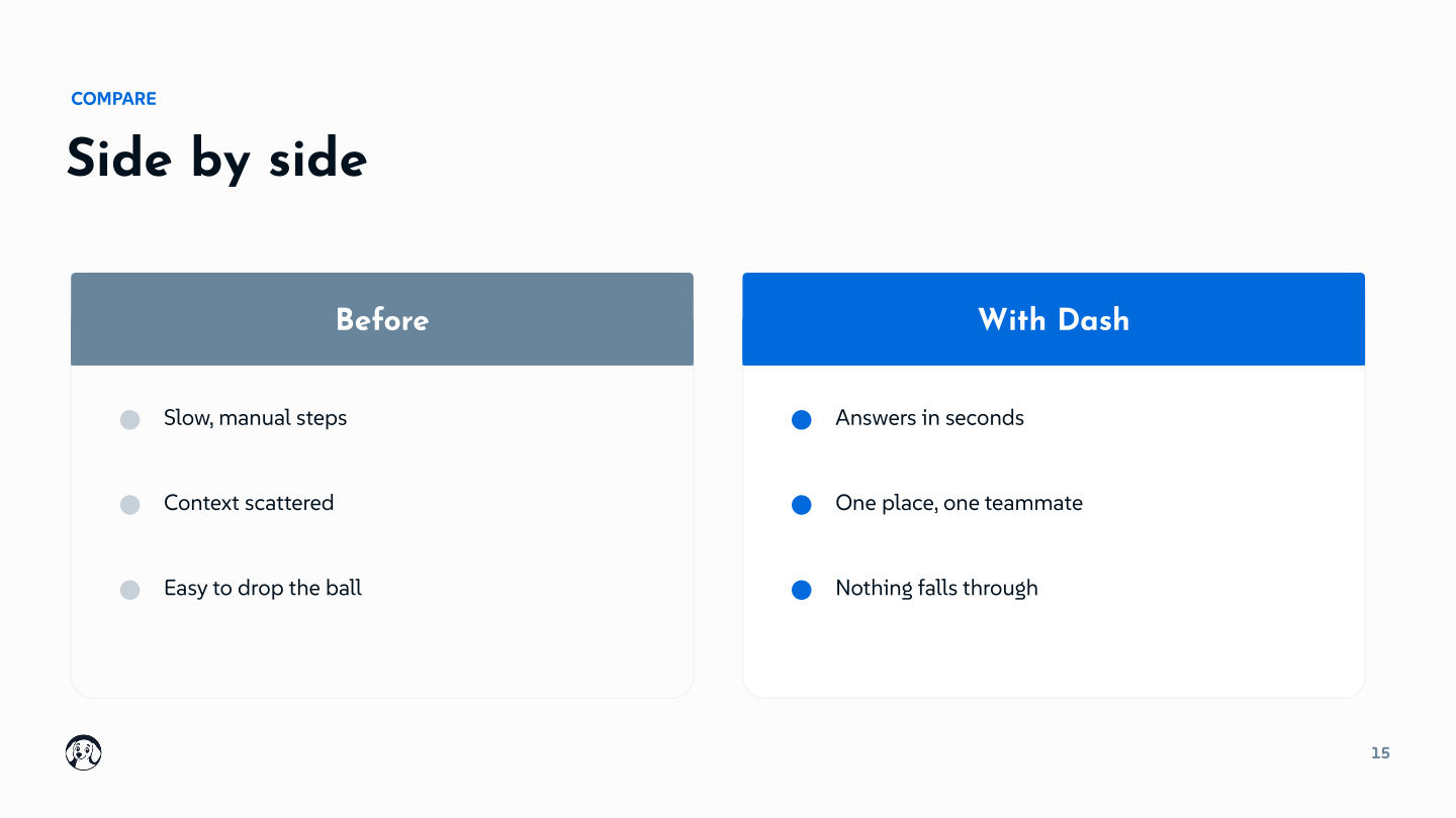
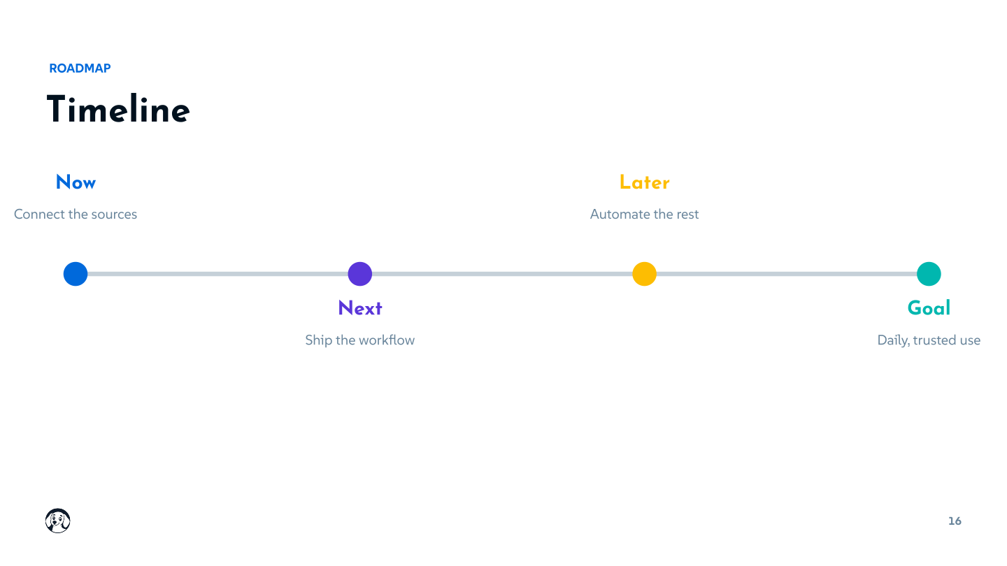
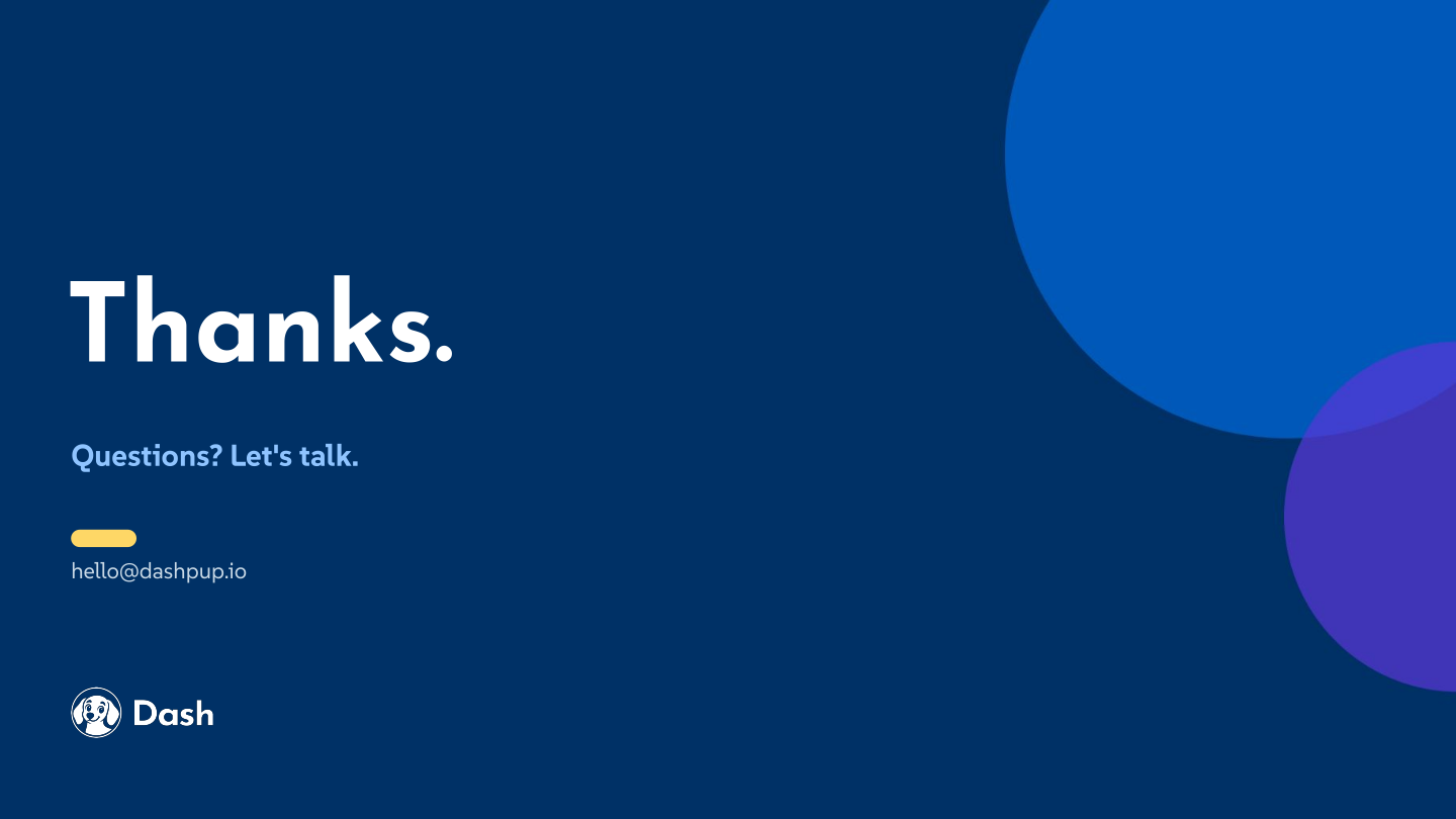
A ready-to-use presentation template, already dressed in the Dash brand — fonts, colors, and layouts set. Use it for pitch decks, internal updates, and customer-facing presentations. Click any slide to view it full-size.